Category Archives: Blend Candy

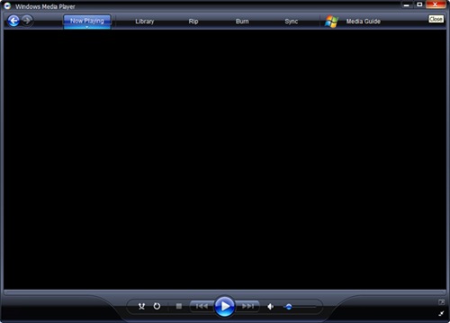
Showing off the power of Silverlight 2.0 – Windows Media Player redone


Sub Heading 5

A couple of months ago I recreated the Windows Media Player interface using Blend and Silverlight 1.1 alpha refresh, I wired up the UI so that it behaved similar to the actual application. It had a lot of code in the code behind that managed the resizing, it also made extensive use of the canvas control for layout positioning,  it had a lot of absolute positioning and funky logic to make it work when the page resized.

Today it’s time to rewrite that project in Silverlight 2.0 beta. The main reason why I’m doing this is because I feel that there isn’t enough examples of real world skinning using the new Silverlight 2.0 bits. There needs to be more samples out there for people to learn from, I for one would of loved to have more demo’s to digest in the early days of the Silverlight 2.0 beta release.

Anyway hope you guys can learn from this real world sample, I know I learnt heaps making it…

[read the article at my new home at Cynergy]

Cynergy Link to my blog posting for Windows Media Player 2

Live Messenger done with Silverlight 2.0 – Login Screen Layout


Sub Heading 4

In this post I will take the login screen mockup and create a Silverlight layout from it. But before I delve into the screens let’s talk about layouts in general.

When building applications one of the hardest things to get right is the layout of controls and how they behave when the application resizes.

When designers create there mockups they generally create screens that are snapshots taken at a single point in time. Some of the more experienced designers produce multiple mockups that show the same application behaving as they’d expect when resized at the same single point in time. I prefer the multiple mockup process showing the effect of resizing but at the end of the day it all depends on what your designers/UX people are willing to do.

Live Messenger done with Silverlight 2.0


Sub Heading 4

In this series of post’s I will rebuild the Windows Live Messenger as a Silverlight 2.0 application. This is going to be a great project to build using the Silverlight 2.0 stack as most of the components required for this application can be found in the new features of Silverlight 2.0 beta.

So why am I choosing to build Live Messenger in Silverlight 2.0 beta? And why messenger?

Messenger despite the simplicity of what it does is an extremely complex application. It has this social aspect to it that in its current state just does not take advantage of. The current Live Messenger can be so much more, and my goal is to build out messenger to realize it’s full potential. Using some new features in Silverlight 2.0 beta I feel like I can truly elevate Messenger above what it currently is to something truly amazing.

Blend Candy: How to create a Gold and Sparkly effect


Sub Heading 5

In this post I’m going to get creative, I’m going to create something shinny and sparkly. 

Recently I saw a great adobe Photoshop tutorial showing how to achieve a “gold effect“.

I wanted to try to re-create that same gold effect using Blend. I also wanted to go one step further and show off the power of SilverLight in that I wanted to animate the graphic, taking it from a static image and transforming it into an amazing user experience. (could you imagine if adobe Photoshop assets could be animated using it’s raw elements, imagine being able to change the lighting effects or the intensity of the gold etc.). SilverLight and Blend allows us Microsoft developers to do just that 🙂

Bare with me as I try to explain what I’m going to create ….

I’m thinking of creating a top banner/header for a RIA or web site. I’m thinking it’s going to consist of a logo/title on the far left and a rotating marquee of messages on the right…

This post will only cover the title/logo part, the Rotating Marquee can be seen in the sample code but I will not cover it here.

image

STEP 1 : GOLD SHINNY TITLE

Using a simple TextBlock spell out the title of your application.

image

image

Next give the TextBlock a “Foreground-Linear” gradient brush. And setup several gradient stops with the following values:

image

image

This is the magic that will give the text that GOLD look.

image

Note: Playing with the gradient stop values you can achieve an amazing assortment of effects from silver to metallic copper to neon pink etc. Over time I plan on building up a library of gradient stop values for specific effects. This gold one is the first of them 🙂

Next let’s duplicate this TextBlock and make it the shadow of the text. Make sure it sits above the previous layer (that we just finished) so that it appear’s behind it as a true shadow does. And give this a simple linear gradient that will make it look like a shadow (play with the colors to make this happen). I’ve included my settings but really you should play with the colors and create it yourself just to get experience.

image

image

image

image

If you combine both the title layer and the shadow layer you get the following result. It’s nowhere near finished but it’s starting to take shape..

image

Next let’s add some glass effect. To do this we are going to create several new TextBlock’s , one for each letter in the title. The reason we need to do this is because we want to align each glass effect letter to the title layer. Confused? Just check out the picture, for demonstration purposes I’ve only shown the “B” however all the other letters can be seen in the included source code.

image

Note that the canvas “canGlassEffects” has an opacity of 18% which gives the “B” and all the other single letters the transparent appearance.

image

The “B” is just a copy of the Text layer but only with the text “B”. It also has the two gradient markers calibrated differently so that the dark center line coincides with the top text layer’s dark middle line. (see following pictures)

image

image

When you combine all the layers now you get the following. Again it’s getting closer to the effect I want but still a bit to go….

image

Next I’m going to give the title a nice dark background “Rectangle”  with a linear gradient brush. It’s just a simple backdrop that will showoff the gold title. Note the gradient stops of the background that give the line down the middle effect, this line needs to coincide with the line through the gold title above.

image

image

image

image

 Now combining all the layers again we get the following…

image

That’s definitely the gold finish I was after.

STEP 2: FAKE LIGHTING 

Let’s add some fake lighting to this title. To do this I’m going to use ellipses with circular-gradients scattered around the title.

image

image

image

image

Notice from the pictures above that it has 2 gradient stops (each with custom alpha’s) and the overall opacity is set to 17% so that it sit’s transparent over the gold title text.

image

The above picture shows only 1 fake light. For the sample I created 4 , here’s what they look like … 

image

When you combine all the layers now you get the following:

Before fake lighting:

image

After fake lighting:

image

Remember that the opacity on the rectangles as well as the custom alphas on the gradient stops gives it that transparent look. The power of SilverLight allows me to programmatically change these alpha’s and opacities, the result can be seen in the animated sample at the end. SilverLight is truly an amazing development and design environment to work in!!!!

The fake lighting using different settings for the alpha’s and opacity:

image image image

STEP 3: TWINKLE’S

Gold sparkles! So how can I create the effect of a sparkle? Simple …

Create a star shape using the Pen tool

image 

image

image

image

image

Note that it has a radial gradient and that the alpha’s (offsets) are set to give it a transparent effect when overlayed over the gold text.

image

Duplicate this path 2 more times making sure that each has a different rotation to give the following effect

image

image

Now make this into a usercontrol, I’ve called mine ucTwinkle. The reason I want do this is because I’m going to add an animation to this control that will make it “twinkle” and then I’ll dynamically scatter them over the gold text.

image

I won’t show the actual code for the Storyboard however it does the following

a) It changes from invisible to visible using the opacity setting

b) scales from a very small size to a large size using a scale transform

Below is a sample of the animation in pictures. To see the actual glitter effect go to the sample animation at the end of this post.

image

image

image 

I’ve captured some snapshot’s of the animation when various twinkles are appearing. You’ll need to look very closely to see the twinkle!

image

image

image

The actual logic to dynamically show the twinkles can be seen in code, it would be faster for you to checkout the code logic than for me to explain it. Maybe I’ll do it in some future posting, what I will say is that it use’s the concept of a game loop to trigger the twinkle’s and what determines if a twinkle runs is a random number.

Conclusion:

The sample SilverLight application can be seen by clicking the big blue button below. The above steps are just simple techniques that if mastered can be customized resulting in an endless number of visual effects. Instead of Gold you can make it silver, make the glow more neon and futuristic. Your imagination is all that limits you. SilverLight in it’s current version in my opinion is feature rich, it’s really up to you the designer/developer to work out how to do something with the tools available to you!

When I see a visual effect that I like I don’t care if it was created with adobe Photoshop. I immediately start envisioning how to go about creating it in Blend and SilverLight…. If you really like an effect then you’ll work out how to achieve it!

As always the code can be downloaded from my skydrive account:

BeautifulMarquee.zip

You can run the sample from here:

As always please keep sharing what you can, we’re all still learning how to use these wonderful toys!

“Colour the World” – my version of an iPod Touch Colour Picker done with SilverLight


Sub Heading 5


I shouldn’t have to tell you of the importance a great colour scheme has on the success of your application or web site.

To create that amazing user experience you have to have a great UI and one of the most important ingredients to a great UI is having a perfect “colour palette”.

Conceiving a perfect colour palette is an art form, great artists devote there whole lives to the study of colour (amongst other things of course).

I am not an artist, and my colour theory is shockingly poor.

I actually cheat when it comes to my colour palettes…  I use

1) Adobe’ Kuler – a RIA flash/flex application that helps you create a good colour palette with virtually no understanding of colour theory.

image

2) ColourLovers.com – a web based community that specializes in a colour palettes and patterns as well as the community around the palettes. They also have a javascript colour picker called Copaso, brilliant application.

image

Kuler also has community features but it is not as lively and involved/fun as ColourLovers.com. My preference is ColourLovers first then Kuler a close second.

I use both to conceive my colour palettes, BUT today I’m going to embark on creating my own colour picker and  palette community. I want to learn the theory behind RGB and Hue/Saturation/Brightness. I want to be able to look at a colour picker and know what those values actually mean.

I want to build this colour picker in such a way that it will look amazing on Apple’s iPod Touch or iPhone. I’m hoping that one day SilverLight will work on an iPhone or iPod Touch (here’s to wishful thinking)

Great Sample that got me started

 The fist step is to see what other’s have done. There is a brilliant sample that gave me most of what I needed to know regarding RGB (Red Green Blue) HSB (Hue Saturation Brightness). The “Scribbler” sample had exactly what I wanted in it for learning the in’s and out’s of basic colour pickers. I can’t find the link to the sample but if you “Google” it or “Live” it then you should be able to find it again. If you can’t shoot me an email and I’ll send you the copy I have.

Colour the World – SilverLight RIA

“Colour the world” is the name I’ve decided to give this SilverLight RIA.

I want to create a colour picker that has dynamic resizing so that it can scale to the size of an standard desktop application or an iPod Touch screen. (The version of my sample demonstrates this ability but the resizing is not 100% perfect)

Also the design of the screens are meant to compliment apple’s iPod touch, in that it has minimum clutter on the UI only showing the bare minimum that it can get away with.

Here are the screen shots of my SilverLight colour picker… It’s only the first version so expect it to have heaps of bugs and for it to change over time.

[screen 1 is the main colour picker screen]

image

[screen 2 is the details screen, shows the RGB/HSB information]

image

[screen 3 is the “save screen”, let’s you save it to the community where others will be able to use it or comment on it]

image

[screen 4 is the “community screen”, let’s you see what other palettes people have saved. Other than showing what others have saved it really is just a view of palettes, over time I will build out this communityh to allow for comments. For the demo purposes it will suffice]

image

[screen 5 is the same application but shown in a resized format, just resize the browser to play with it. As I mentioned earlier it isn’t perfect but it will do for the demonstration]

image

Click the following image to play with the demonstration. You need SilverLight 1.1 to run it.

As always’ the source code for this SilverLight Application is free. Currently it sits in a very messy state, but still readable. It needs a lot of refactoring, I’ll save that for the next version (hopefully after SilverLight 2.0 is released).

Source code: My SilverLight Colour Picker Source Code “Colour the World”

You can find this in the “A Beautiful Website” section of this site, over time I may move it into it’s own area but for now it will sit there!


Conclusion

This was my first foray into the world of colour theory and I have to admit I’m loving it. “Colour the World” is a project I envision continuing to update over time,  ultimately adding new features that will rival those of “ColourLovers” and Adobe’s “Kuler”. I do this not because I want to compete with them BUT because it’s a great learning experience for me.

What amazes me is the ease at which I created this application using C# and Blend. This new world of SilverLight is really going to be huge, applications of the future are going to be immersive experiences that really captivate the visual senses. I can’t wait to see what other’s build !!! 

Please leave comments on what you think of the RIA, also remember to share what you can 🙂

Oh and if you like the article or application feel free to kick it 🙂  kick it on DotNetKicks.com

Blend Candy – Windows Media Player


Sub Heading 4

need silverlight 1.1

Update: Fixed display issue with Firefox and IE6 

Update : Re-written sample in Silverlight 2.0 beta

In a previous post, “Blue glowing glass button“, I confessed my adoration for the user interface of windows media player 10 11(thanks AvatarX for the correction). I talked about how I loved the dark coloured theme, the glowing effect of the buttons and the glass effect overall. I went on and demoed the power of Blend and SilverLight by creating a blue glowing glass button that could be programmatically changed to any coloured glow.

image

The UI is just stunning, I love everything about it. I’ve never grown tired of it’s UI since first using it years ago, it’s a timeless design.

SilverLight and it’s accompanying tools (expression Blend in particular) have single handedly changed the face of web development such that UI designs like WMP’s can now be easily incorporated into web sites and web applications.

What I really want to say is that “there is no reason why web sites/applications of the future can’t look like WMP”. What ever an artist dreams up should now be possible to translate to the web even to the finest detail.

Imagine all the future RIA’s with the polished finish of the WMP UI.

This posting is about taking the WMP UI and making it into a SilverLight application. Bringing the beautiful UI in all it’s glory to the world of the web. Showing that any future web application can be more than just a mashup of static images.

The blend created xaml asset or WMP is pictured below (click on it to go to see the SilverLight RIA in action). It took around 2 days to create. The reason it took 2 days is because

1) attention to detail of the buttons and glows,

2) I wanted to optimise the shapes and placements of the layers – removing unwanted shapes, moving the layers around so that they could be animated in an optimal way etc.

3) Getting the resizing working so that elements resize proportional to the browser and each other.

[click on picture below to go to the SilverLight sample]

image

As you can see the likeness to the desktop WMP is very very similar. I’ve said it before and I’ll say it again, SilverLight and Expression Studio have really hit the nail on the head for RIA and future web development. The MS team behind this magic definitely need a huge bonus payout because in my opinion they have single handedly changed the face of web development.

I’m trying not to be such an MS fan-boy but I really can’t help it. When I do small projects like this it just amazes me the potential that SilverLight and Expression Blend has to changing the face of web sites/applications.

Flash/Flex and SilverLight/Expression(+other MS technologies still in beta) are going to usher in a new world of web sites and web applications.

Just like Ajax and the glass button defined web 2.0 (from  a UI perspective), Flash/Flex and SilverLight/Expression(+others) will usher in what will possibly be called web 3.0 (or rather the time of the RIA). I really do hate the web 2.0 terminology but alas it is now engrained within our technology collective so I must use it 😦

From a web development perspective, the importance of getting the UI perfect is going to be paramount to succeeding against your competition. If we start to see beautiful sites/applications with WMP UI’s (which I guarantee will happen in the next 2-3 years) then we as designers/developers better get our skills polished for the next phase of web wars about to begin.

Have you started on the path of learning SilverLight / Expression yet? Have you started looking at other beta products of Microsoft’s such as Astoria or MS Sync Framework, or Live Streaming Services? If not you better start now because these technologies will be the bread and butter of web development in years to come. 🙂

Microsoft thanks again for the innovation that is SilverLight and Expression. I look forward to my next project, I’m always motivated to do more with these technologies!

This project can also be found under BlendCandy, don’t forget to check out other freely available assets in my library!

The demo site is here: Demo Web Page of Windows Media Player

The source code can be found here in my skydrive account: WindowsMediaPlayer.zip

And please feel free to leave comments and remember we are all still learning SilverLight so please share what you learn!

Blend Candy : Another Blue Glowing Glass Button in the style of Web 2.0


subheading 3 

Does anyone else here like the Windows Media Player UI besides me? I have to admit that I’m a sucker when it comes to rich dark colored UI’s. I love black and I love the glass effect.

windowsmediaplayer

[screen shot of my Windows Media Player 11 – Beautiful and black!]

What really stands out for me are the buttons, the glowing glass buttons. Mesmerizing, elegant and perfectly functional. Hover over a button and it glows blue, or red depending on the type of button.

   windowsmediaplayerbutton         closebutton

I’m going to recreate these beautiful glass buttons in Blend. I’ll do it in such a way that the glow can be controlled programmatically, so you can set it to what ever you want 🙂

[20 minutes later]

Here’s the result of my Blending, they are just xAML assets that haven’t been animated …

normal

Picture (above): Default button

blue

Picture (above): Blue glowing button

red

Picture (above): Red glowing button

So now begins the fun bit, explaining how I created these!

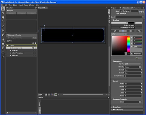
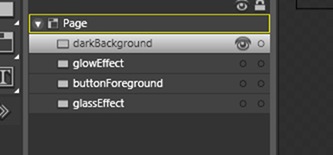
Step 1: Create the outline for the button as a “black shape” with rounded corners. Duplicate this 4 times and name the layers as follows:

2  

1

darkBackground Layer: This pretty much stays as is, it will provide the dark background for the actual button. [Important: Opacity for this layer is 100% and it sits as the top most layer]

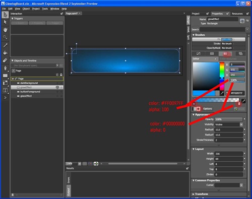
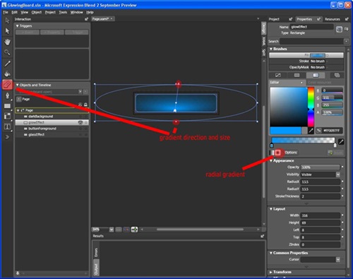
Step 2: glowEffect Layer: This is the eye candy of the whole thing. This layer gives the glowing effect, you can change the color of the glow very easily in this layer. [Important: Opacity for this layer is 100%]

3

4

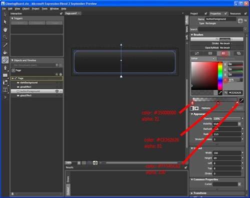
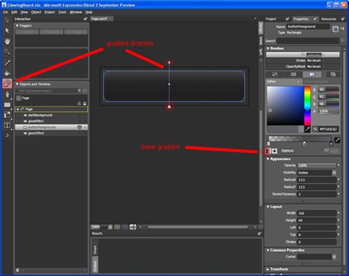
Step 3: ButtonForeground layer.  This layer gives the actual button it’s look, it has the shading and it allows the glow to shine through it. [Important: Opacity for this layer is 100%]

 5

6

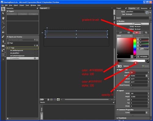
Step 4: GlassEffect layer. This layer is the sugar coating for the button. The result is a white shaded rounded rectangle at the top part of the overall button, this is so web 2.0. [Important: Opacity for this layer is 9% – gives the see through glass effect]

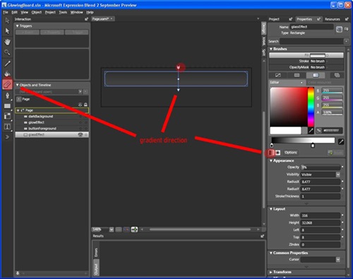
Take the original black rounded rectangle and resize it to half it’s original size. Then set it to a gradient brush with 2 color markers as follows:

7

Now set the gradient direction as follows:

8

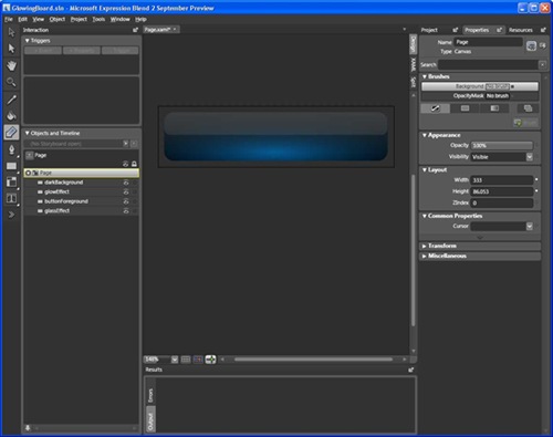
Finally: combining all the layers results in the desired glass button

9

Overall this took around 20 minutes to create using blend. The fun bit will be to animate it which will come in some future posting. Or better yet one of you guys do it and send me an email and ill reference your sample from here 🙂

Source code for the xAML can be found here: GlowingBoard.zip

Link to other cool graphic assets can be found in my “Blend Candy” area.

Enjoy and remember to share what you can, were all still learning SilverLight and Blend!